Day 5: Transitions

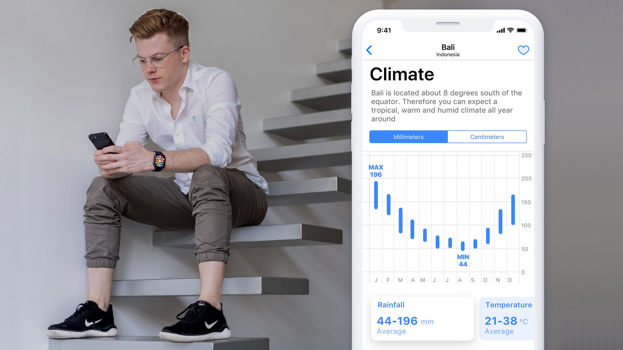
Based on the prototypes we came up with on Day 4, we can really start to create a realistic-looking flow from the splash screen all the way to some specific data points in a particular destination.
This would almost be enough to qualify as our first MVP (minimal viable product) to begin testing with potential users.
The key with transitions and animations is to stay closely aligned with Apples Human Interface Guidelines (or, whichever design principles you're following). The purpose for this, is to keep the transitions compatible with the native UI elements you're using and to make a conscious effort to maintain the usability of the app.
There's nothing worse than out-of-place transitions and animations. They should remain useful, engaging and usable for the user.
Day 5
I've opted to record the process in a video format - this is completely new for me!
Your feedback (publicly or privately) will help me improve. I welcome feedback in all forms; as trivial as the film making style, as high-level as the structure of the content or as potent as the idea, process or software I'm using
Write a comment, send me a message on Twitter, LinkedIn, Instagram or send me an Email at info@darceybeau.co.uk and let me know your thoughts 😄
Additionally, I will be publishing here on my blog once tomorrows video is live. So, feel free to subscribe to my mailing list using the subscribe button at the bottom of this page if you'd like to stay updated
Thank you for taking the time to read this and I will see you tomorrow 👋
- Darcey Beau
Thank you for checking out this blog. You can see more of my work on my website, darceybeau.co.uk, or my Dribbble profile, or my Behance profile. You can email me about working together at info@darceybeau.co.uk You can also follow me on Twitter, Instagram, or Unsplash. Have a great day!

